🏛
AU SOC Branding
Client
American University School of Communication
American University School of Communication
ROLE
Lead Designer
Lead Designer
Over two years, I was the sole designer on a small team of three (alongside a content strategist and director of communication), producing 150+ pieces for American University's School of Communication.
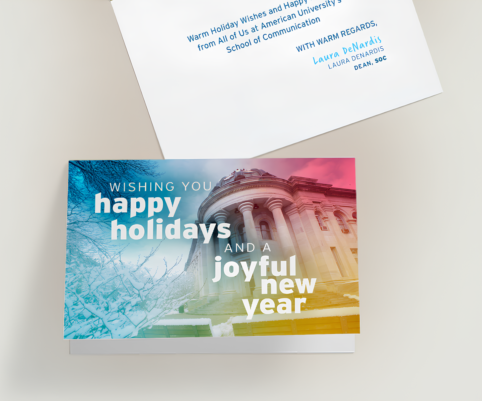
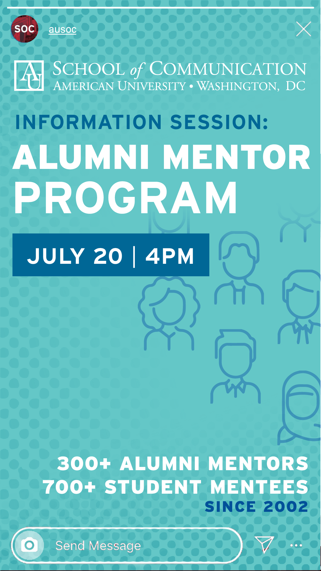
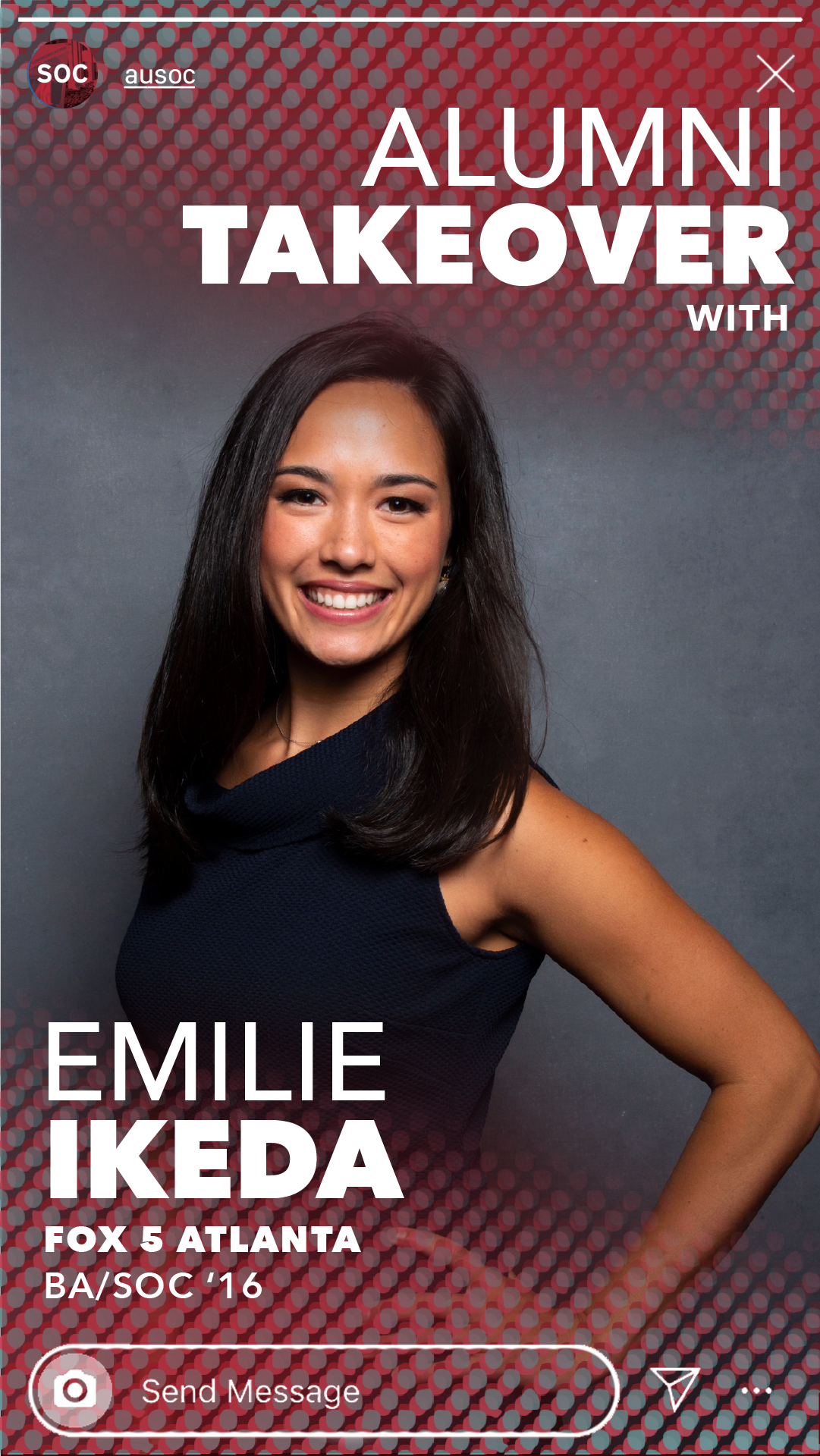
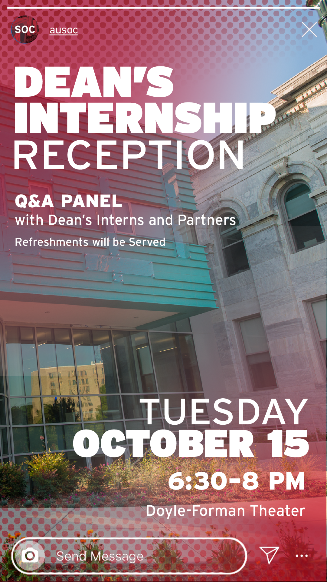
I established a flexible visual system grounded in AU's brand colors and Interstate font, and created a halftone texture pattern that became a signature element. The halftone adds interest, energy, and texture to what could otherwise be flat approaches to digital design — bringing the tactile quality of print together with digital media in a way that harkens back to SOC's historical background in communications. The system was scalable, which helped support such a large breadth of work and allowed for variety while keeping the visual language consistent across mediums and platforms.
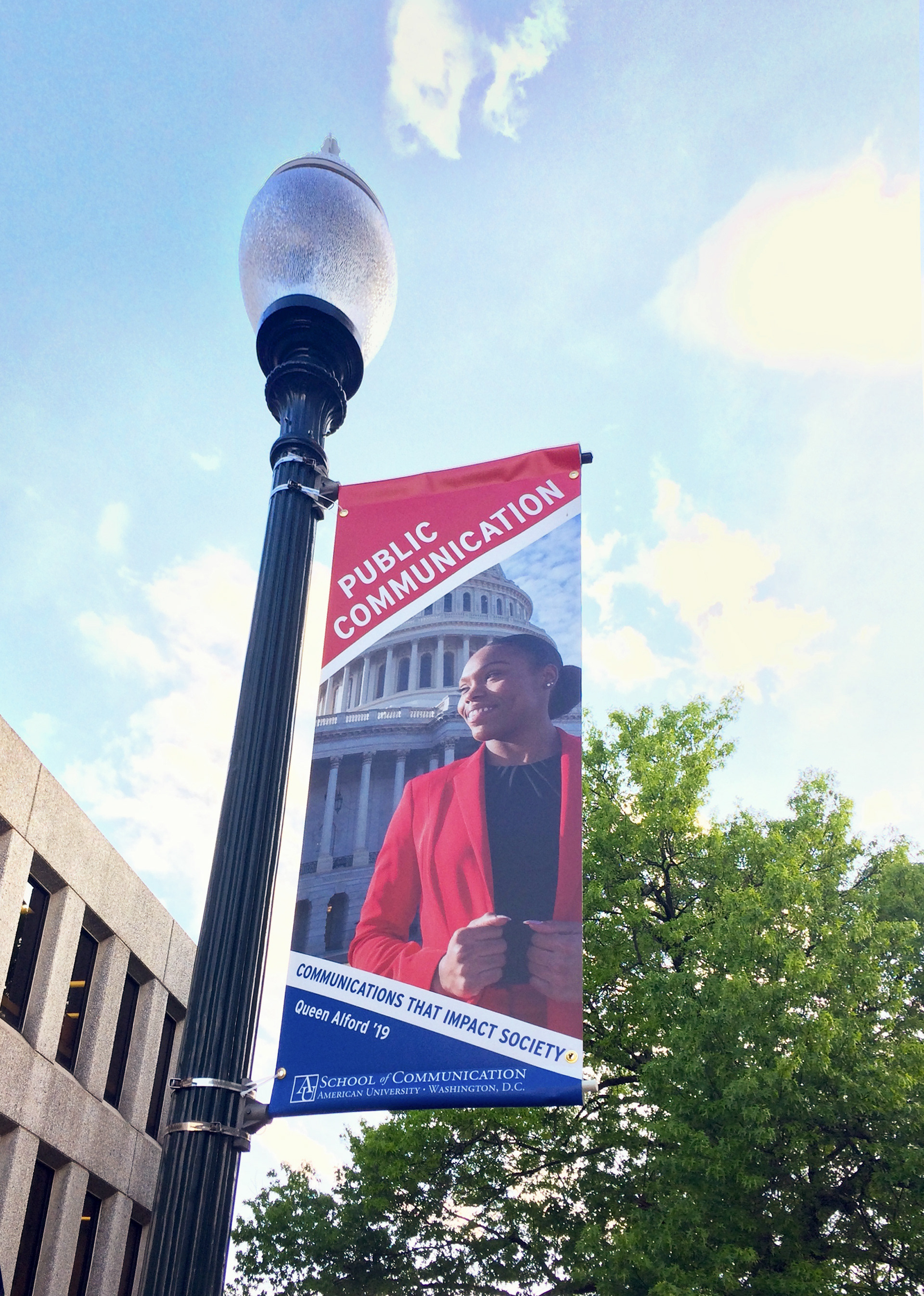
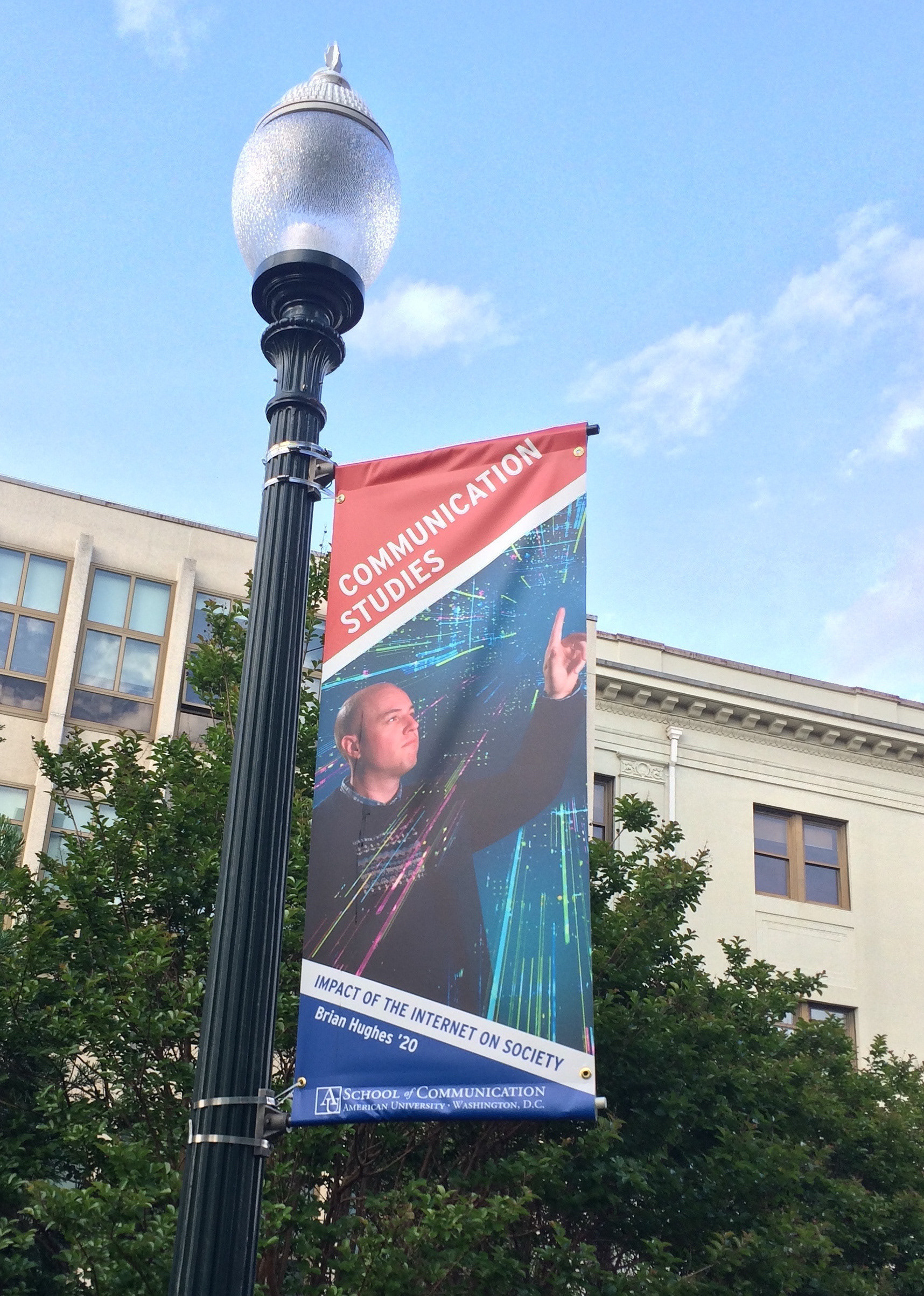
The street pole banners were designed about a year in and required a different approach. They had to represent the broader American University, so I left the halftone texture off to keep them more elevated. They were also the most production-intensive pieces — coordinating between the photography team, my two managers who had detailed review, and a few iterations to make sure everything was fully refined before sending to print.
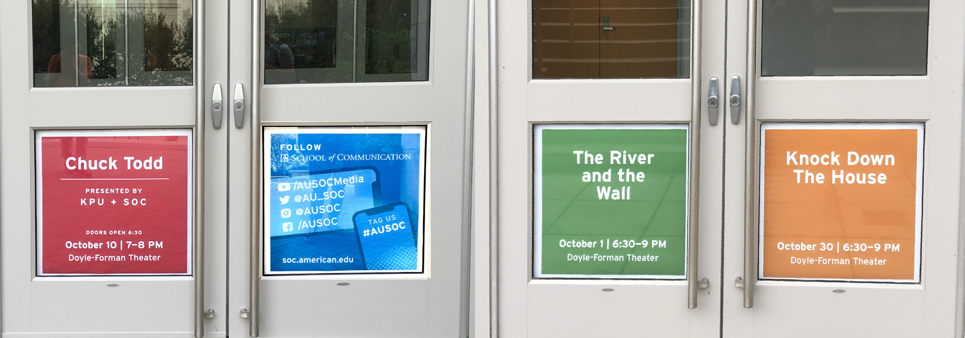
The event posters and social media assets maintained coherence through a consistent format structure and flexible typography, with modular layouts that could be quickly adapted while keeping brand consistency across course announcements, alumni features, and event promotions.