🔖
Natural History Museum Branding
Independent Brand Redesign
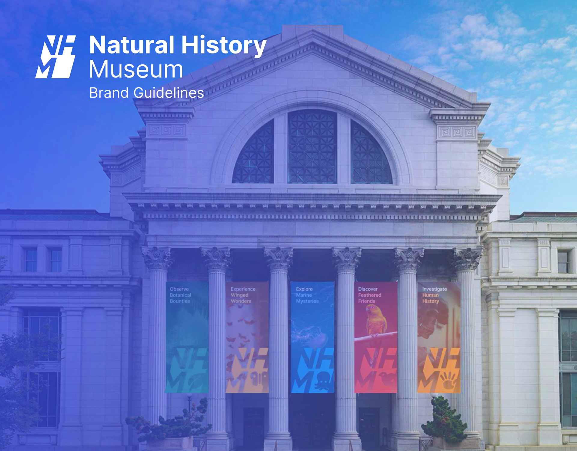
This is a full brand redesign for a natural history museum. I wanted to do something connected to nature, kid-friendly, and grounded in a real museum I could visit in DC — so I used the Smithsonian National Museum of Natural History as my research reference.
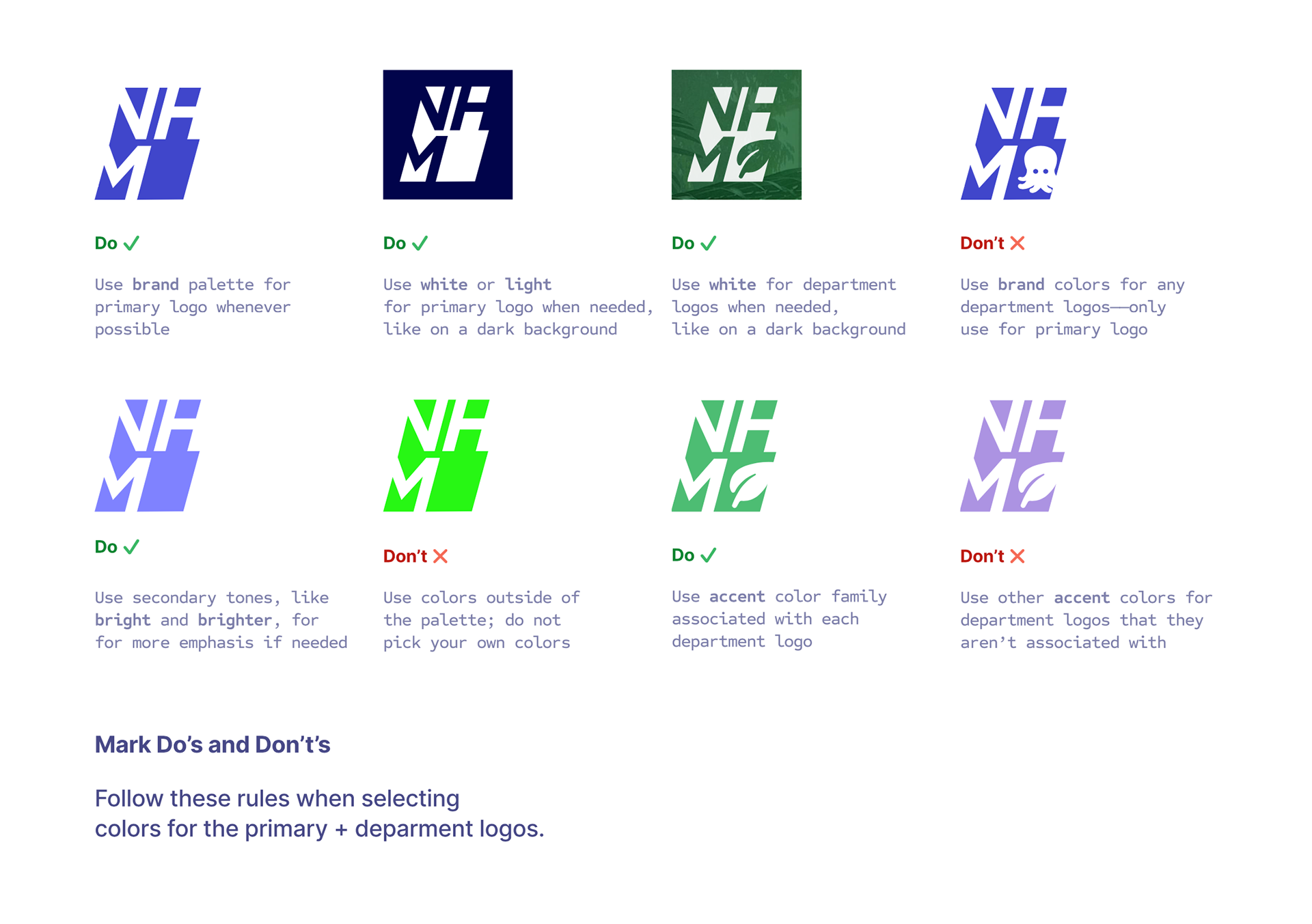
Most museum identities go safe and neutral. I wanted the opposite: bold, colorful, and unmistakable while still feeling institutional. I went through about 10 monogram options before landing on the stacked "NHM." The early versions were either too purely typographic (combinations of letters in neutral fonts, lacking character) or too decorative and literal (leaf icons, fossils, ambiguous iconography). The expressive letterform-based monogram found a good middle ground between those two extremes.
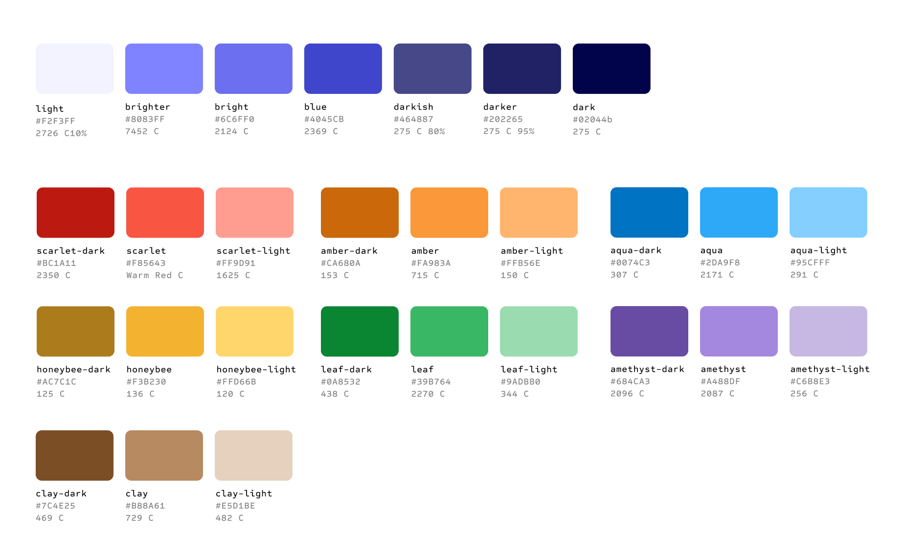
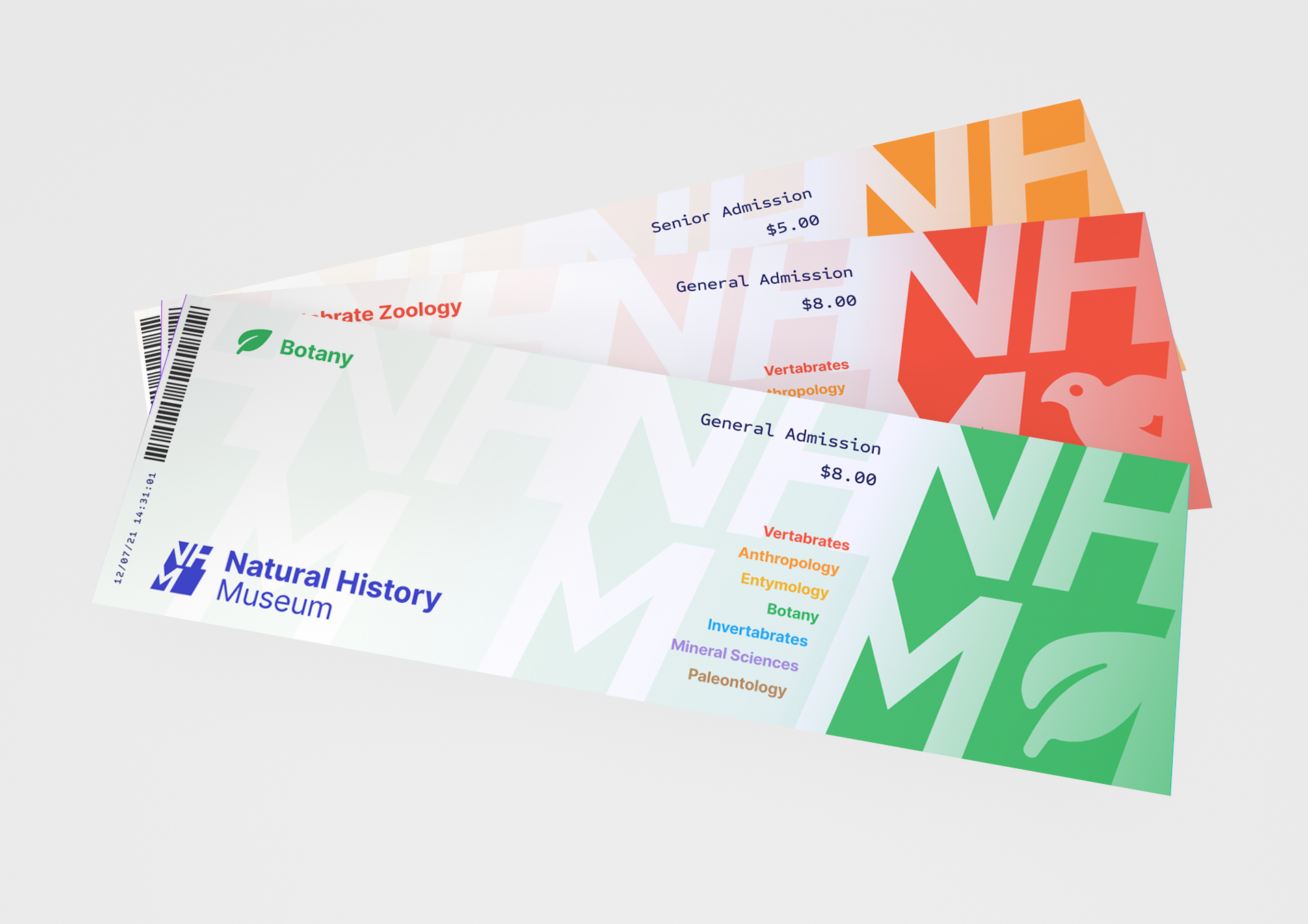
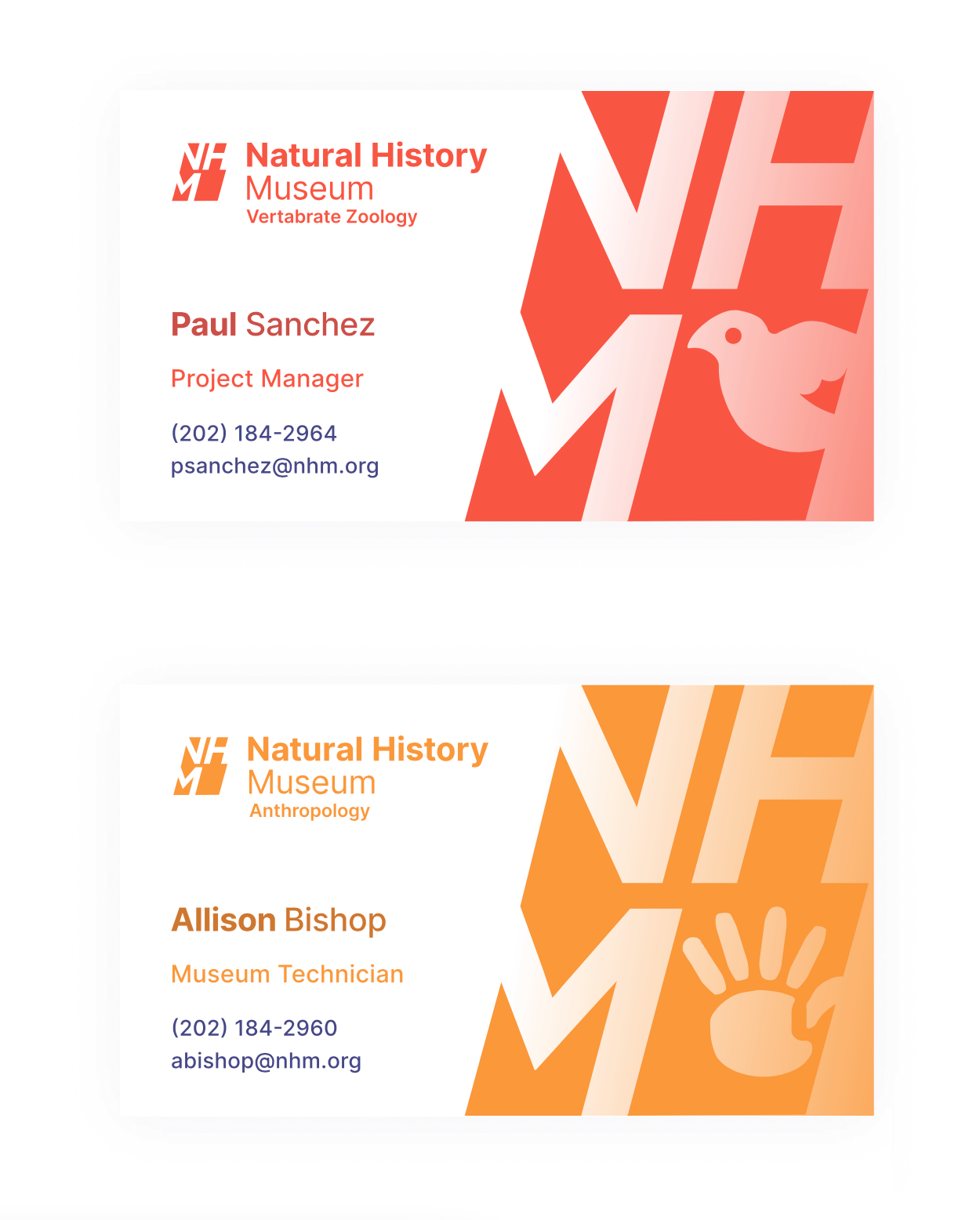
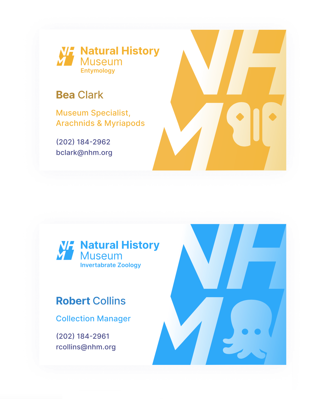
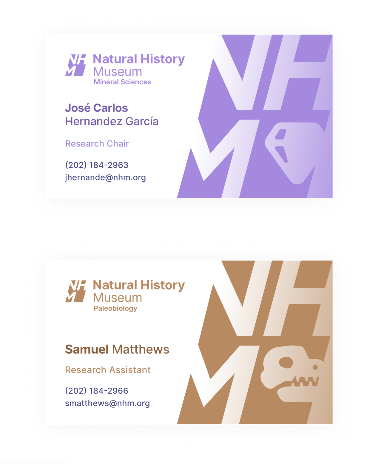
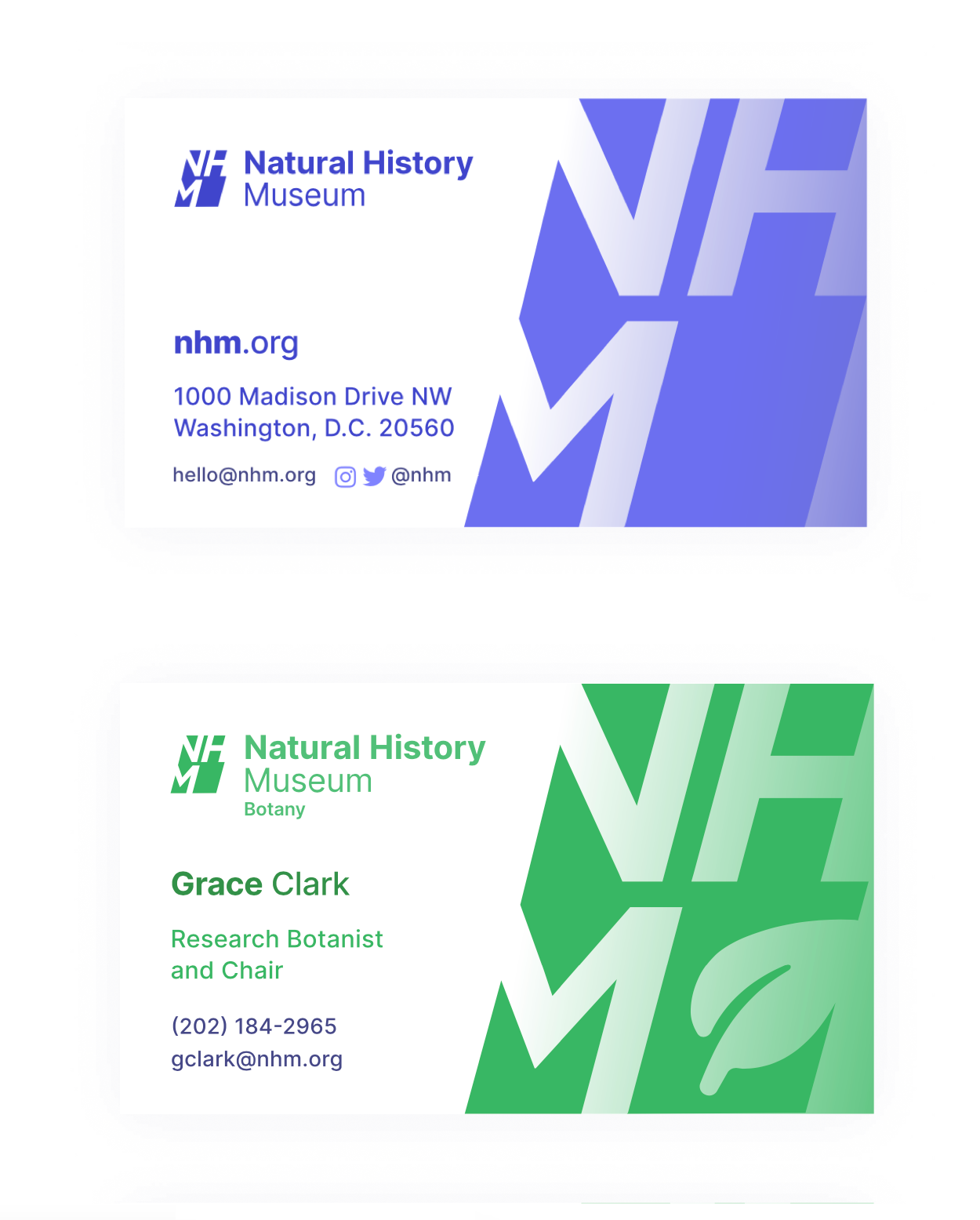
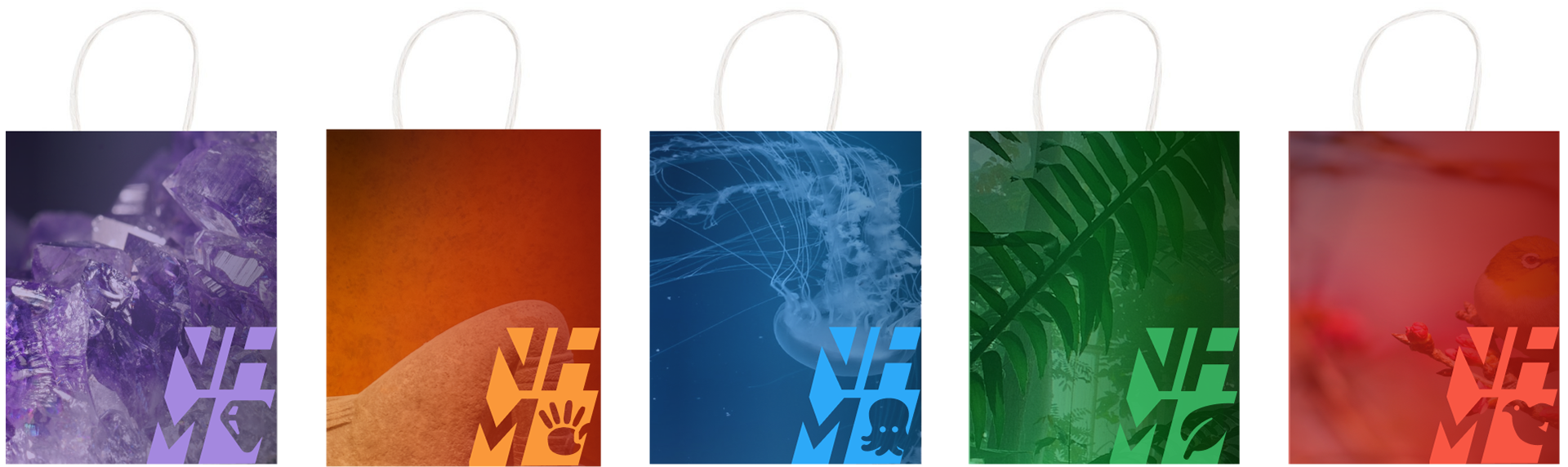
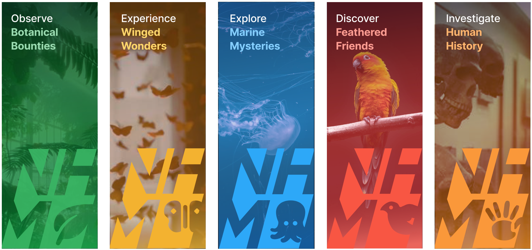
The color palette grew naturally from the department work. I knew each department needed a distinct color, and the naming convention (scarlet, ocean, honeybee, leaf, amethyst, sage, clay) was important to keep it all connected. The shades and tints emerged as I iterated on the logo and ticket designs. The department icons were sketched by hand first, then moved to vector — designed at a consistent level of abstraction so they read as a family.
I documented the full system in brand guidelines with usage rules and do's and don'ts, because a brand this colorful needs clear guardrails or it falls apart the moment someone else applies it.

Admission Tickets
Business Cards
Gift Shop Bags
External Banner Signage
Brand Guidelines